DESIGN | MARKETING | MEDIA
home | about us | careers | our approach | portfolio | raves | blog | in the press | contact us
Is your design project lacking that special pop? It’s likely what you are missing is enough contrast. Contrast provides differentiation between elements, making each one look more individual, prominent and special. Design contrast is created in a number of ways, and using all different types of elements. From typography to color to space, creating contrast can take a design from bleh to wow. Here are five ways to do it.

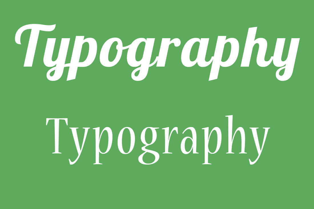
1. Make It Bigger (or Smaller)

Symmetry and order can be a trap of sorts when it comes to creating a focal point in the design. Too many elements with equal weight will end up looking the same. The easy solution is to make one element significantly bigger or smaller. The item that’s different becomes the immediate foal point. The user will be drawn to that area of the canvas because it is different. Making an element, photo or text block bigger or smaller is more than just physical size; it’s visual weight as well. The easiest way to understand this is with typography. Look at the images above. Both words are the same “size,” but note how much more weight one of the versions has. This contrast is due to thick versus thin strokes in the letterforms. You can apply this same concept to almost any other design element as well. Look at the website for Little Flyers, above. Pay particular attention to the text based navigation at the top of the page and buttons at the bottom of the screen. Which text draws your eye faster? Why? All of the type is the same size, but the treatment with a box inside a colorful photo makes it seem bigger.

2. Add a Little Texture

With flat and minimal styles as the dominant driver in design trends right now, texture is less common than it once was. But you still see it in plenty of places, maybe without even thinking about it. Changing from a flat element to anything with a texture, pattern or three-dimensional style will help create an area of focus. And while adding texture to a background might be the immediate solution, it can be used in other ways as well. Consider a text element with a textured feel. (This is quite popular with many vintage typography styles.) The primary types of texture are rough and smooth. They can work with each other or in isolation to help create visual focus. When working with printed design, you can physically add texture based on the type of paper used, letterpress options and through other publishing methods.

3. Change the Shape

Look at the image above. What is the first thing you see? For me it is the circular object with the question mark inside. Do you know why? In an image full of rectangles, it is the only circle. The difference of the object is what makes it stand out. The fact that the character is upside down is also an attention-driver. Changing the shape or orientation of an element can add immediate impact. Try it next time your design feels a little flat. Round the edges of buttons. Put a photo in a circular frame rather than rectangular. Opt for a vertical photo. Use a placement that’s just a little off kilter. Any of these techniques might make you a little uncomfortable at first. But keep experimenting and playing with options until you transform that same old rectangle into something a little more interesting.

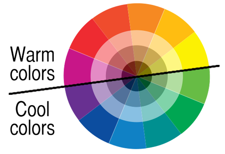
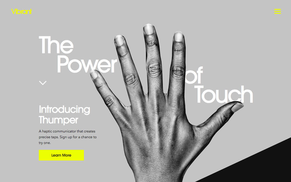
4. Add Color (or Take it Away)

Color theory is one of the most important concepts at your disposal. By changing hues, or adding or removing color, you can change the overall mood of a design. Color can make things appear big or small, daring or subdued. The trick to some of the most brilliant color palettes is through the use of contrast. The simplest form of contrast starts with the color wheel. Pairing colors along the wheel results in various contrasting combinations: • Complementary: High intensity pairs from opposite sides of the wheel • Triadic: Colors spaced in one-third increments along the wheel. • Split-complementary: A color and the two colors next to the complementary hue. There are other color contrast options that can work particularly well if you already have a color palette and don’t mind making subtle adjustments. • Mix up warm, cool and neutral colors. • Change your base color by adding tints and tones so that the saturation is different from color to color. • Intertwine light and dark colors; think of it as yin and yang. • Add elements without color. Black or white accents can add emphasis in spaces with a lot of color; and color can add contrast to black and white.

5. Do Something Unexpected

An unexpected shape or detail can add just the right amount of contrast as well. A surprise in the design is anything that does not quite match everything else, but still works in harmony with it. These elements include: • An element of asymmetry in an otherwise symmetrical design. • A visual cue that leads you through the design, such as an intense shape or eye-tracking pattern, such as used in the site for Vibrant, above. • A change in a pattern or repetitive element. • Changing the orientation or alignment of an element or text, such as in the Anima (with the letter “I”), above. • Changing the positioning or size of one element in a row of visuals. • Different style of imagery, such as change from photos to an illustration or a hint of animation. • Mixing complex and simple visuals or typography styles.

Conclusion

The nice thing about changing contrast between elements is that it can provide an immediate impact in a design project. By altering the look of elements, you can change visual focus and help users hone in on the part of the design that is most important to the message. Lack of contrast is a common, and often easy-to-remedy problem. So many times when you hear the dreaded “make it pop” from a client or co-worker, what they are really trying to say is that they would like to see more contrast in the design elements. Now you are armed with the tools to take on that challenge.

5 ways to boost contrast in your web design

6201 DALE DRIVE PO BOX 663 MARION, MS 601.513.7478 © 2017 DENNEY AGENCY